Split Pane and Conquering Design Challenges
I’ve always thought about frontend coding as something magical. It brings beautiful static designs to life. It turns them into something pretty, but also readable and useful. It makes them accessible for different users, browsers, platforms and devices (this can be the most challenging part of our job, but also - when successful - the most satisfying).
Frontend combines two different spheres: the art of creation, and the world of technology. This is why I like it so much!
I know that CSS is not strictly considered a tech language - its main role is prettification.
Nonetheless it does exist in the world of tech, and it is constantly being improved and developed.
Fortunately, I can do things now in CSS that, a few years ago, I would never have imagined.
Flexbox,
Grid and
Custom Properties
are each great examples of this.
They say frontend developers are learning all the time. We are never bored. New languages are created. New ideas, tools and concepts are constantly emerging. This is very inspiring but can be overwhelming at the same time. Luckily, to know specific technologies is not so important. The most important thing is to be able to solve problems and be a creative thinker. And that is the most interesting part of this job. I’m always open to learning new things in design. In fact, I look forward to it. The only thing which kills my creativity is boredom.
I’ve been working with OnePageCRM for almost 10 years now. As the app is growing, we’re constantly challenged to design something new on a weekly basis. For the most part, these changes are small. What really excites me is when there is a big UI change. I simply love getting stuck into these types of projects.
Hence, this blog post is about my experience with a new design project called “Split Pane”.
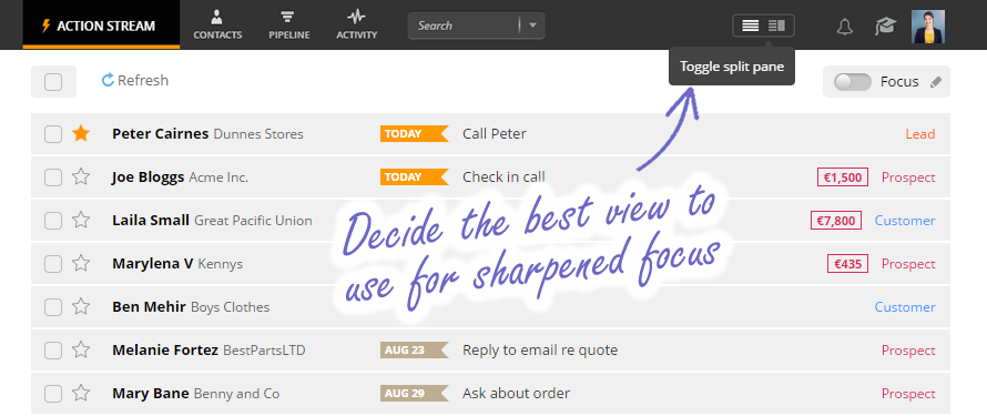
The idea of Split Pane
The idea of Split Pane was to give every user the option to easily switch between Single Column and Split Pane views. You would use Single Column view if you want an ultra focused view of the contact and all it’s details, and Split Pane view for quick light touches when qualifying leads. You can read more about it here.
And this is the part where our CEO made a confession, Split Pane had been available long before Single Column view. So the idea was not new, but the concept of changing the layout in a split second without reloading the page, now that was going to be a challenge!
In practice
So my first question was; How can I let the user access two layouts for the same page?
This is actually very simple in CSS.
We are using two CSS classes for the <body> of the page, one set of CSS rules for common elements of the two views, and two different sets of rules just for the differences in each layout.
Quick and simple.
Unfortunately this method is not without its difficulties either. When creating the frontend design for an app like OnePageCRM, I had to keep lots of things in mind. For example I needed to make sure I kept the simplified design, but also ensure that it remained elegant, given that there is lots of content in small boxes next to one another surrounded by icons, tooltips and popups. All of those elements have to look nice and clear, be readable, useful, pixel perfect and responsive, all at the same time.
In addition, with our new view switching feature, they have to fit smoothly into two layouts where one of them has two (or three if we consider the left menu) separate panels, with separate scrolls and fixed positioned elements, which always have to be visible.
The elements must fit perfectly when the user is changing the view or the size of the window or editing data on the page.
It could have easily been a nightmare from the HTML and CSS point of view.
Not to mention, the OnePageCRM app already has a lot of options and functions where the user can change their settings, as well as some in-built user specific settings (for account owner, administrator, user, focused user).
As a result, the main page or UI can look different for two users, even in the same browser, resolution and view.
What was the hardest part?
The main task was to improve the existing layout of the current application, adapt it to the new design by rewriting the CSS code, and most importantly not to break anything along the way.
I ran into some problems with the responsiveness and pixel perfect design. Is it even possible to apply both these extreme design concepts at the same time? I had to find a compromise.
I received three concepts of the precisely designed layout for small, medium and large screens.
The plan was to have perfect alignments, line spacing, typography and sizing, and at the same time make the elements fluid and fit well for different resolutions and views. I had to use a little bit from both design concepts (responsive and pixel perfect) and create something in between.
Here are the main points I had to consider:
- (Obviously) fit the elements smoothly into the two layouts, for different browsers and resolutions, and keep control of almost every pixel.
- Keep in mind that we display different content for different users (roles of the user, their settings, instant editing). Any bug or issue could completely destroy the design, which is built on, and depends on, these rules.
- Ensure the design was the same no matter what the browser. I have to admit I couldn’t avoid all hacks (we still support IE11 after all).
- Keep the DRY (Don’t Repeat Yourself) principal in mind. It’s a basic job for every programmer, but it’s not such an easy task when working with an app the size of OnePageCRM.
What CSS rule was the most helpful?
Luckily CSS (as a language with a limited set of rules) can also be very clever and surprisingly comprehensive.
In the end, I could find a solution for almost every problem. All I had to do was to analyze the issue and think about all the possibilities and dependencies, make some prototypes, and then use the best solution.
- Cascading -
This is a basic feature of
CSS. In this case, it was a concept of twobodyclasses toggled when a user is changing the view. It gave me a lot of freedom in styling the same content differently for each of the layouts. I am using those classes mainly for styling the main structure of the page.
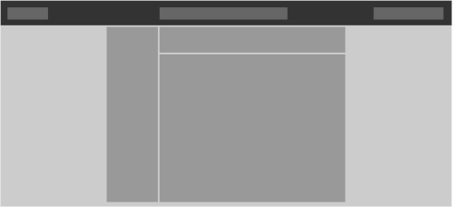
Single Column view
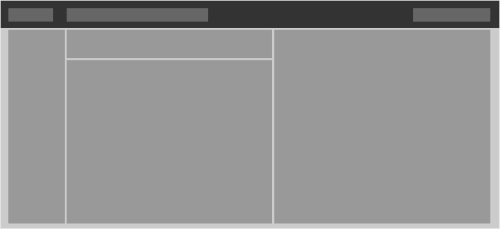
Split Pane view
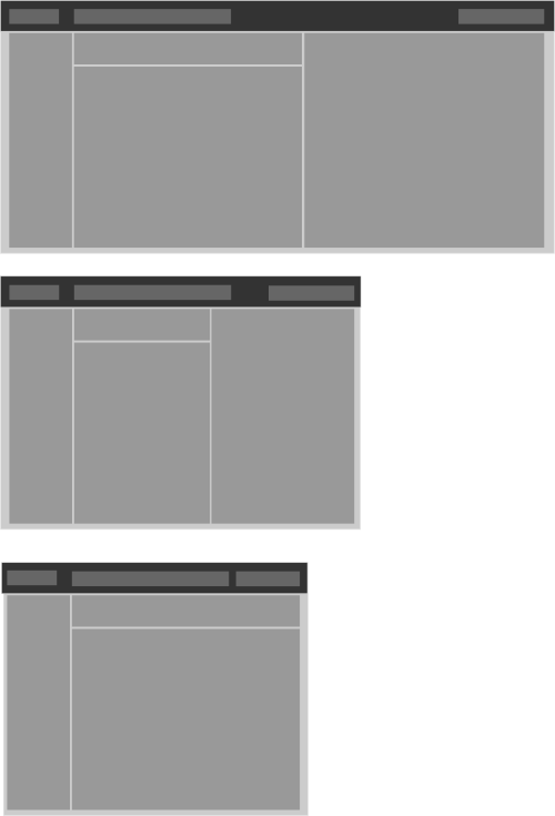
- Media queries - This is a necessary rule in any responsive design. In this project, it is used mostly for creating the breaking points of small, medium and large screens.
-
Compromise 1 - Some of the elements on the page need to have a fixed size like the left menu, logo and top menus. The Contact list and Contact view could be more dynamic and adopt the available/remaining space.
-
Compromise 2 - On very small screens, we are hiding the right panel and the view is back to its basic fixed Single Column state.
-
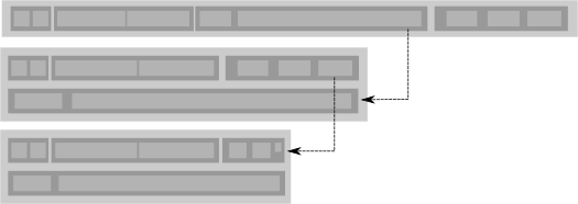
Flexbox - Flexbox can be a very powerful rule used to create the structure of the entire page. I use it mostly for small elements like contact lists, activities, bars and tables. This is a very helpful
CSSrule for instant content changing, and ensuring the page is responsive when there are many elements in the same block, which have to fit to one another, but at the same time be able to change based on the resolution.
-
Calc() - The
calc()rule together withoverflow hiddenoroverflow ellipsisandmin/max-widthare used quite a lot. It is very helpful for continuously changing content focused on small ‘one-line’ areas. -
Additional ‘special’
CSSclasses - Sometimes I needed the ‘special’CSSclasses for ‘special’ situations.
Closing thoughts
Implementing Split Pane was not an easy task but one I really enjoyed. It was the perfect opportunity to improve old code, learn new things and to resolve interesting new problems.
This blog has given me food for thought.
Maybe in the next post I will describe (in detail) all the improvements and CSS tricks I used in our design.
I guess you’ll have to come back and see!
Image references: OnePageCRM and CommitStrip
